The Political Geography Of Wisconsin: Partisanship And Population Density

Wisconsin has been a battleground state in presidential elections for decades, but over time, the political landscape has shifted.
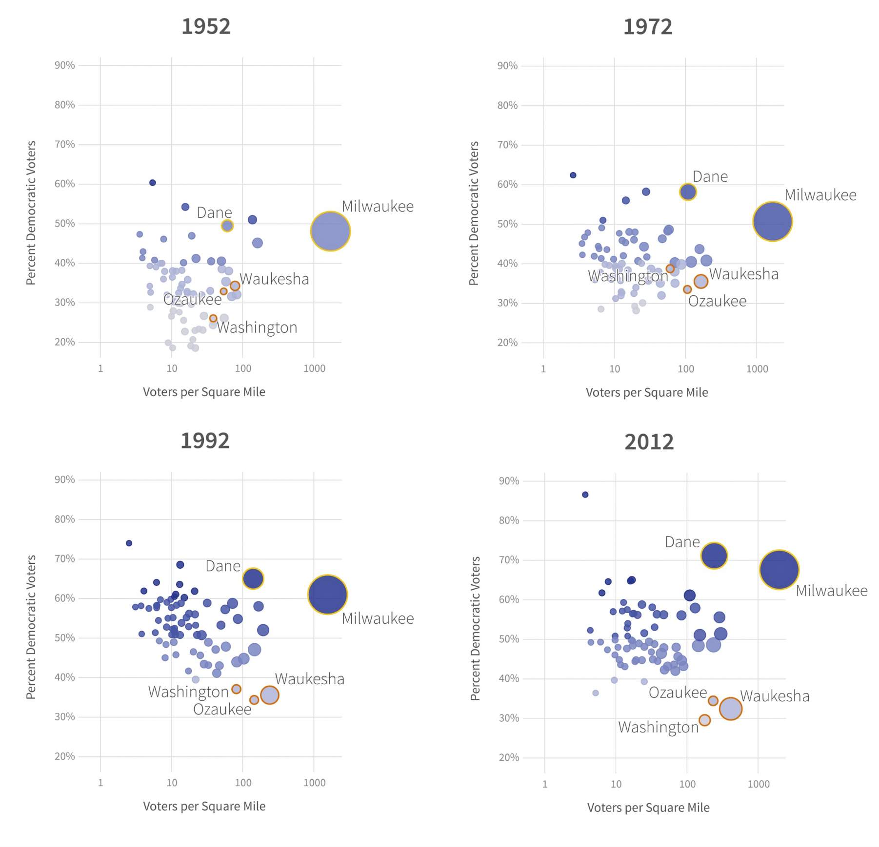
Voting patterns are increasingly becoming defined by geography, with population density serving as a marker of partisan preference. As the New York Times recently reported, between 1952 and 2012, counties with more voters per square mile increasingly supported the Democratic candidate for president over the Republican candidate. It's a realignment that is connected to ongoing demographic changes across the United States, and how its population as a whole is increasingly polarized by where people live.
The political polarization of American voters is often summarized by the shorthand of the red state-blue state divide, but there are also partisan patterns within states. People increasingly live among people who hold similar political preferences, a trend explored in the 2004 book The Big Sort by Bill Bishop and Robert G. Cushing. One way to look at this division is between rural and urban areas, as was done by University of Wisconsin-Madison political science professor Katherine J. Cramer in her 2016 book The Politics of Resentment.
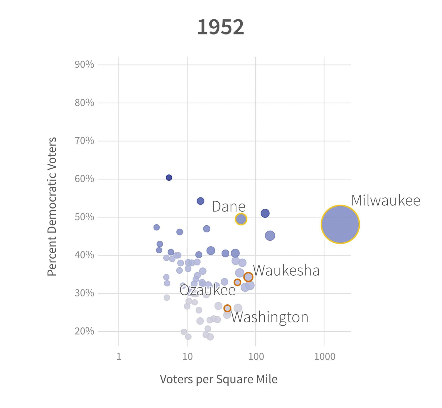
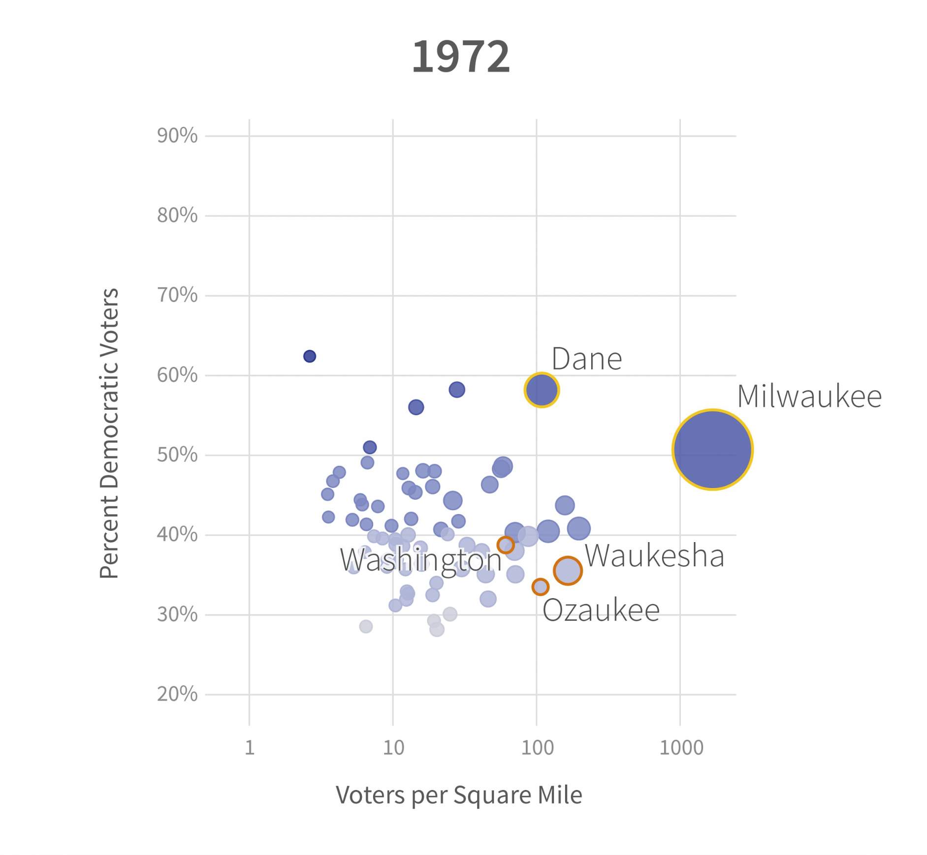
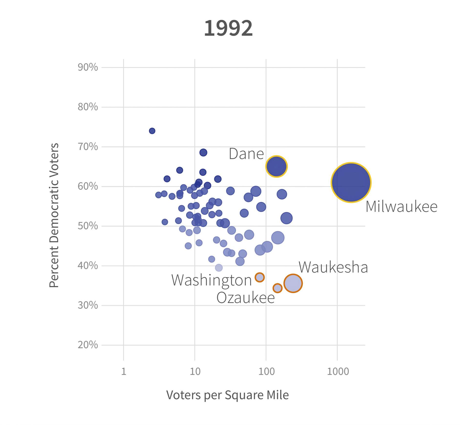
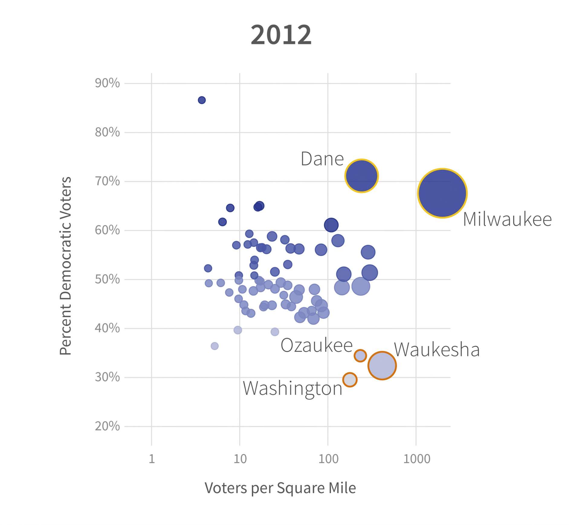
A look at how population density and partisan preferences intersect in Wisconsin over four presidential elections – 1952, 1972, 1992 and 2012 – indicates urban-suburban-rural patterns of partisanship. Densely populated urban counties are somewhat more likely to vote for the Democratic candidate and less dense counties for the Republican candidate. The size of Milwaukee County plays an important role in state election results and there are distinct exceptions to the urban-rural trend, but both help define the political terrain of the state.
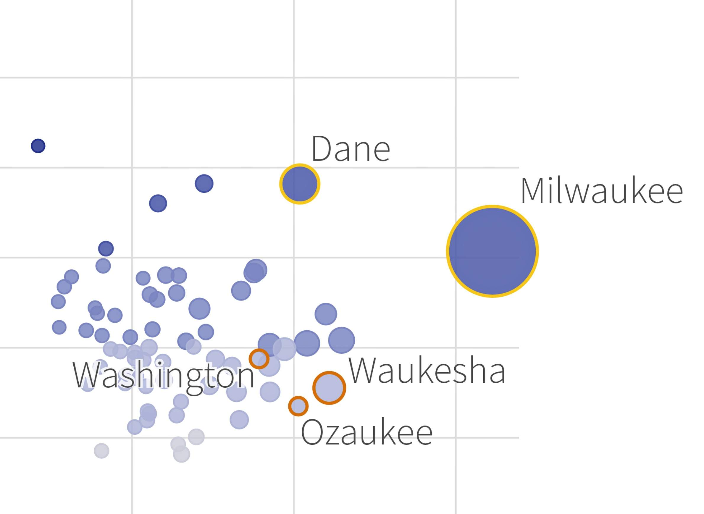
The accompanying charts show the density of voters per square mile plotted against the proportion of voters who voted for the Democratic presidential candidate, by county, in four elections over the past 64 years. The size of the dot is proportional to the number of voters in the county, with a larger dot representing a county with more voters. Counties shown in darker blue (and higher up in the charts) voted more Democratic.
A lot has changed since 1952, but one of the most notable shifts in the charts is the polarization of Milwaukee and its suburbs. The largest dot, representing Milwaukee County, has not grown much in population size — but it has become more Democratic-leaning. In each election shown, the county has gone more "blue," and it was one of the state's two major Democratic sources of votes in the 2012 election (along with Dane County). This shift reflects national trends in urban voting patterns.
The charts also highlight a countertrend. The three primary counties housing Milwaukee's suburbs — Waukesha, Ozaukee and Washington, often referred to by Wisconsinites as the "WOW counties" — have grown substantially in population and simultaneously become more conservative.
Race, income, or education could also be plotted instead of the percentage of Democratic voters — the pattern would appear to be very similar. Strong patterns of urban-suburban residential segregation in Milwaukee have emerged over this same time period. Higher-earning, white residents have departed Milwaukee for its suburbs, concentrating relatively poorer, less-educated and non-white residents within the city itself. Income, education and race are strong predictors of political affiliation — as highlighted by the Pew Research Center.
The same process has been happening on a smaller geographic scale within Dane County. However, it's harder to see this trend in the chart because Madison's suburbs are well within Dane County — additional data would be needed to see within-county trends.
With so much polarization in the political geography of Wisconsin, Republican and Democratic presidential candidates can — and do — focus campaign efforts in areas where they are likely to reach sympathetic voters and boost turnout.
Malia Jones is a social epidemiologist with the University of Wisconsin Applied Population Laboratory who studies segregation and its health consequences. Caitlin McKown, a web developer with the UW Applied Population Laboratory, created the charts.


